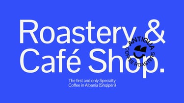
Antigua
BRANDINGWORDMARKSYMBOL
Ben
2/16/20254 min read
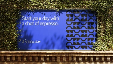
Fancy a cup of Espresso?
Been a while since we've been active with the blogs, it was time to showcase the process of Antigua & how their lovely symbol and brand came to life.
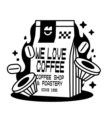
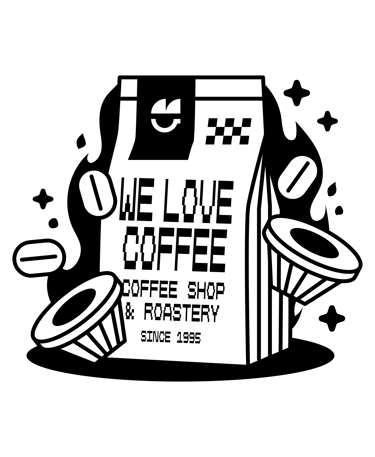
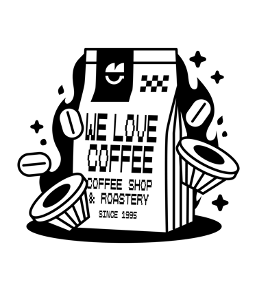
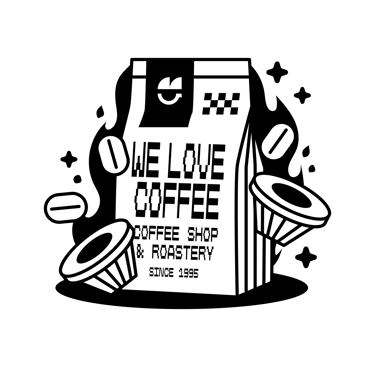
The Antigua Rebrand
We've worked with Antigua during 2023 & 2024. With their assistance and knowledge of the coffee world, we've given them a fresh new look which they'll continue their journey with. We appreciate all the feedback they have provided and the professionalism they've showcased throughout it all.
Digital, traditional and everything else. We have refreshed everything that Antigua has & offers.
Grab a cup of coffee (necessary) and enjoy the project.

A unique coffee shop exploring the universe of coffee flavors. Roasted with care in mind, supporting ethical farmers around the world.
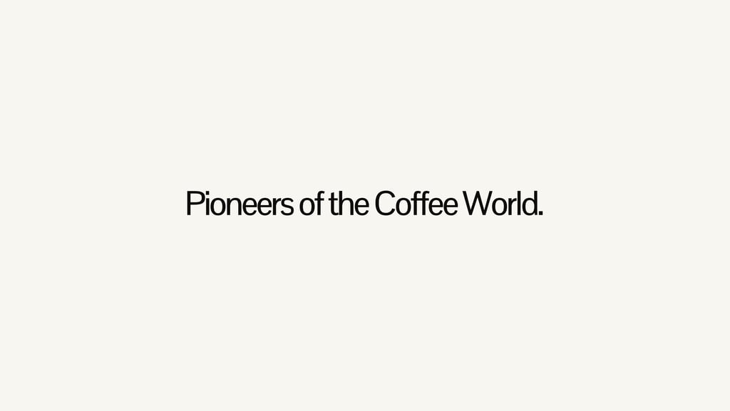
Antigua is a pioneer in the coffee industry. They've started in 1995 and have perfected their craft throughout all these years. They are the first to bring Specialty Coffee in Albania (Tirana) and they have the most unique coffee ranges possible.


A bit about Antigua
Roasting has been their starting point since their inception and they are proud to say that they maintain the same attention to detail to this day. The roasting area is their playground. It is where they enjoy experimenting with different roasting methods to achieve what is called the "peak" - the point where the nuances of flavor reach their peak.
A must visit place if you are traveling through Albania.
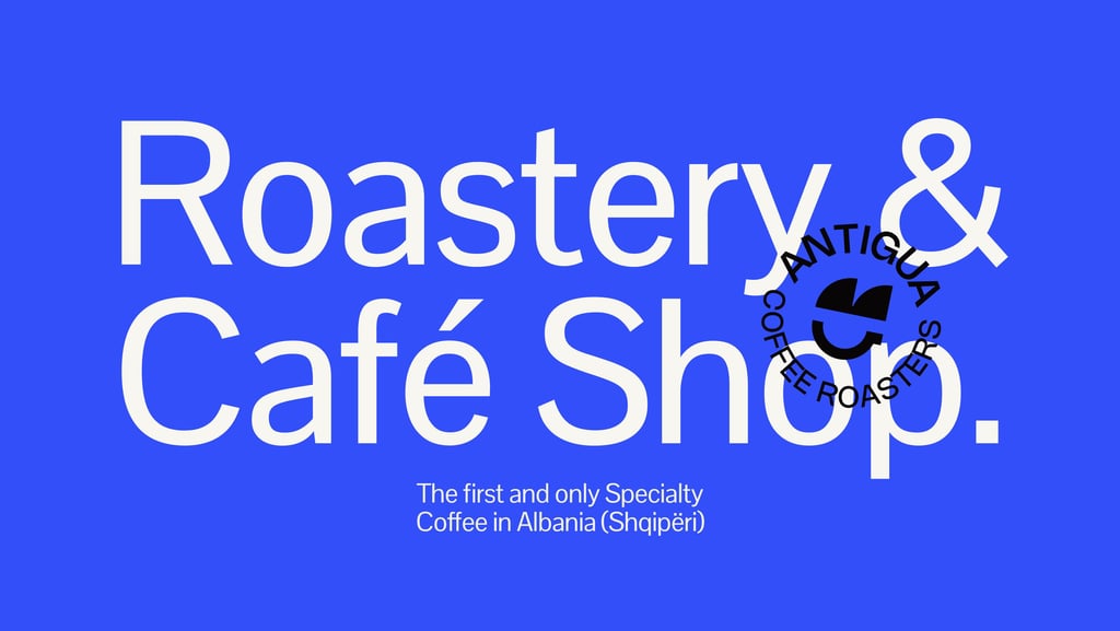
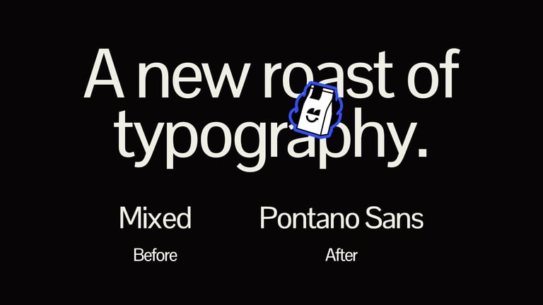
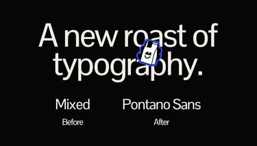
We've made sure that every single detail is taken care of, that is why we've started from the typography. Before the rebrand they were using different types for different uses, we have switched all the used types with Pontano Sans. A nice sans that is both a workhorse and unique in character.
Starting from the details
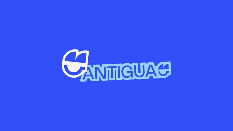
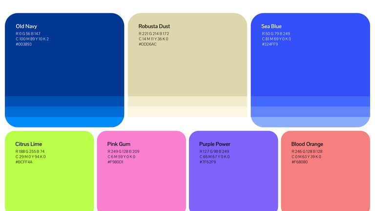
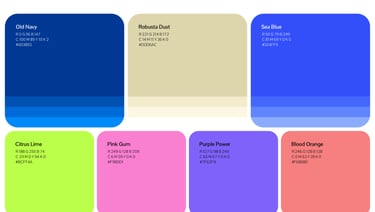
Same treatment can be said for the colours. While the old colours looked great they did need a bit of spice added to it. We've taken them and modified them heavily. Saturated, amplified, game-ified.
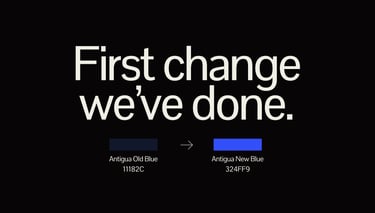
The team at Antigua wanted to keep the original colours alive but tweak them to match the new brand. The blue was the first one to undergo "surgery", from the existing nuance we have crafted 2 main nuances and 8 total nuances to play with.
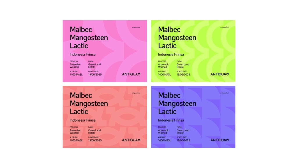
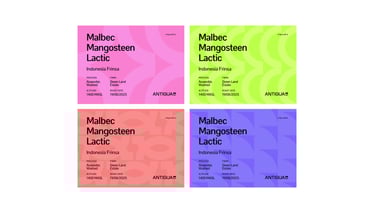
This, not including the new colours we have added - which are super fun to work with... especially when it comes to coffee packaging. The opportunities are endless at this point!

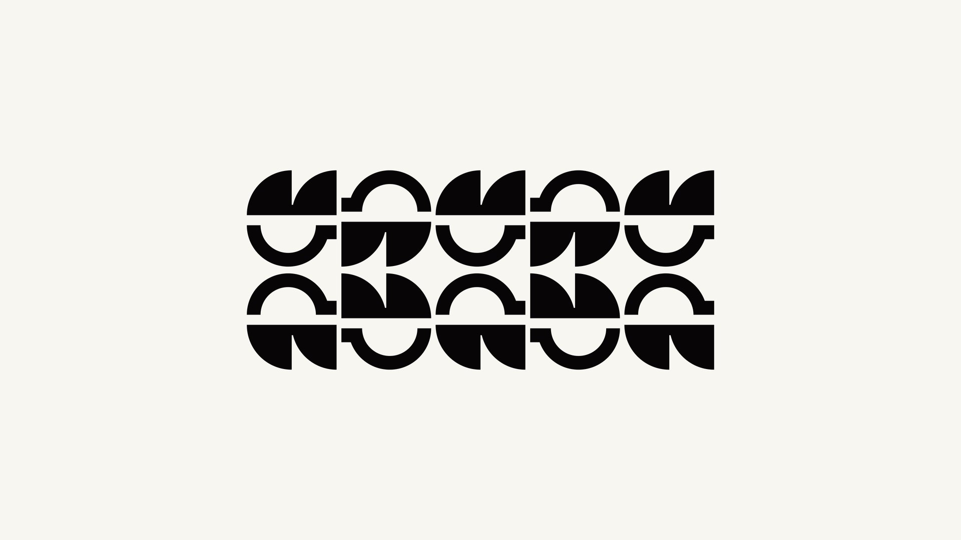
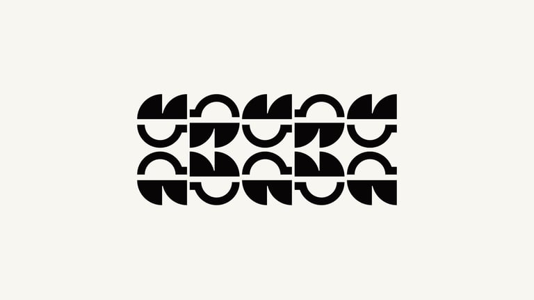
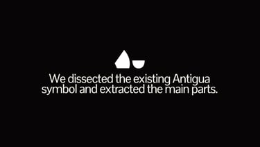
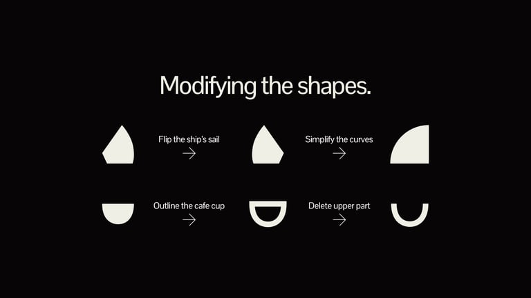
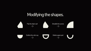
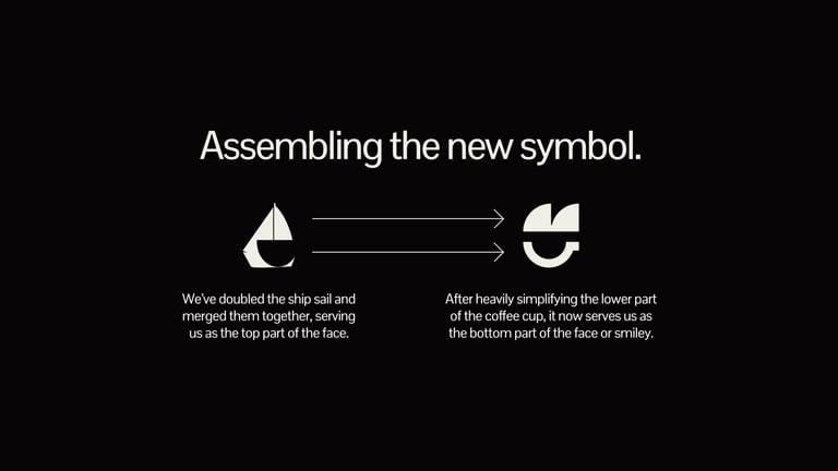
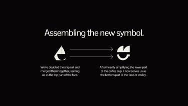
Crafting the new symbol was super tricky, especially when the brand is already established (for many years). Countless, and I mean countless versions were tested... Masking out the cup, combining them together, doing some weird mashups to get the right angles, nothing was working.
At that point we switched the approach, seeing if there is a possibility to give new life to the existing ship & coffee cup.
And so, the process started. We dissected the main parts and played around for a while, after some experimenting we landed on the now well known & loved ship + smiley symbol that Antigua has.
See the slides below for a visual explanation.
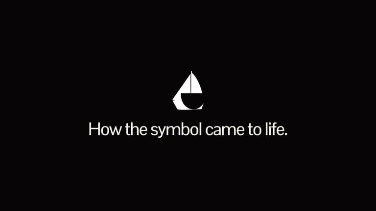

How it all came to life.
Liking our blogs? Check out more here.