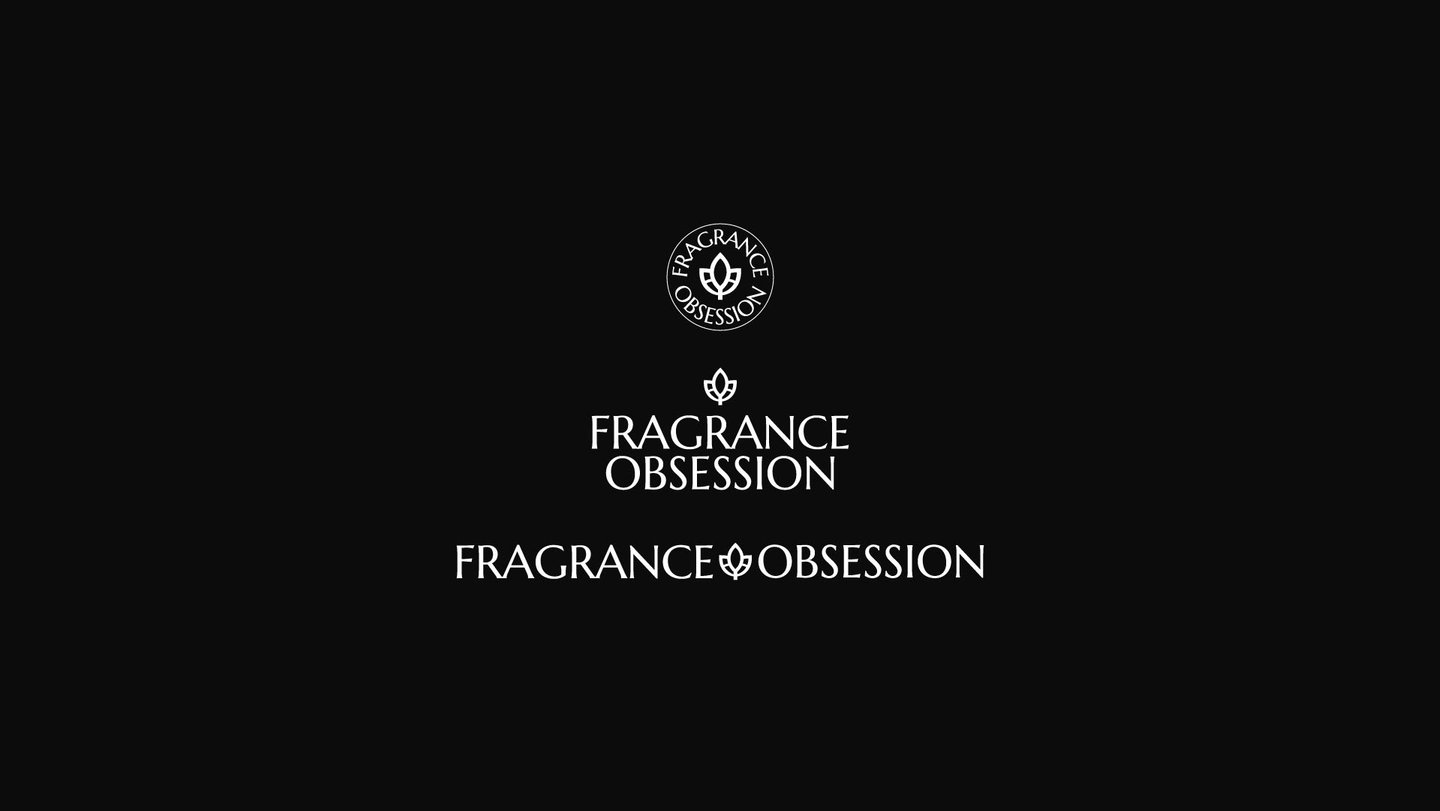
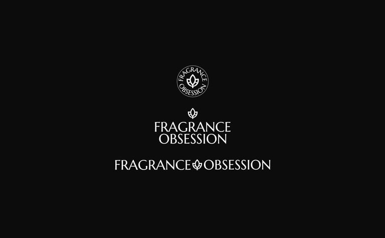
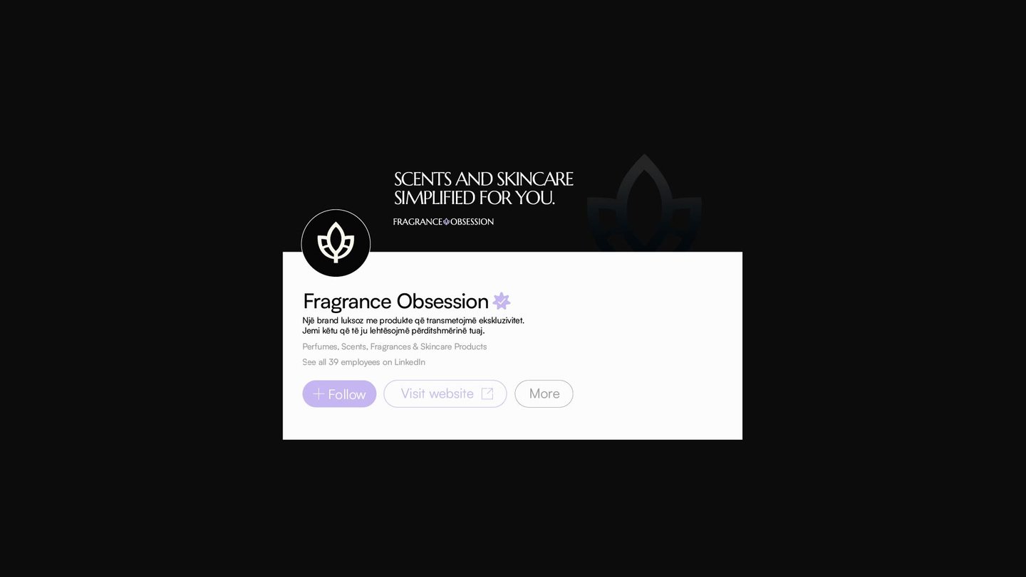
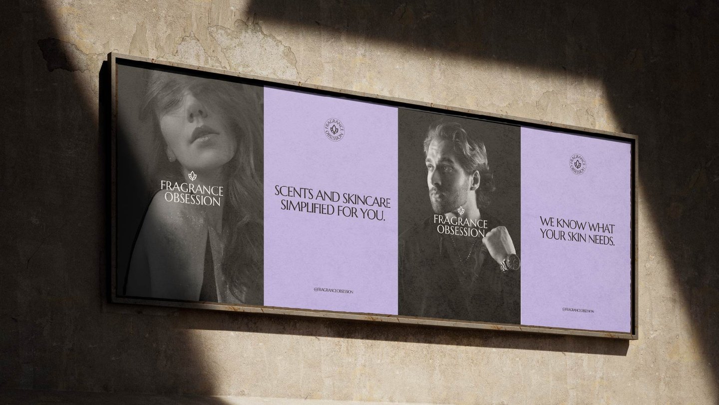
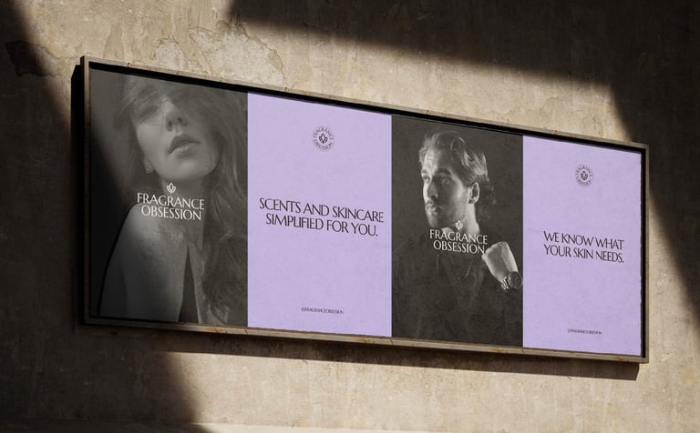
Fragrance Obsession
BRANDINGWORDMARKSYMBOL
Leo
7/14/20233 min read
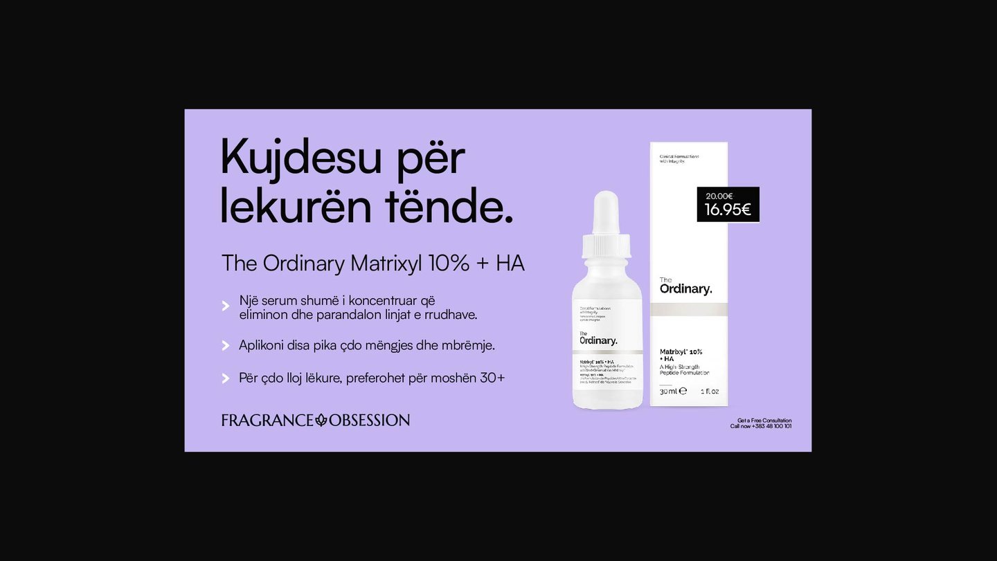
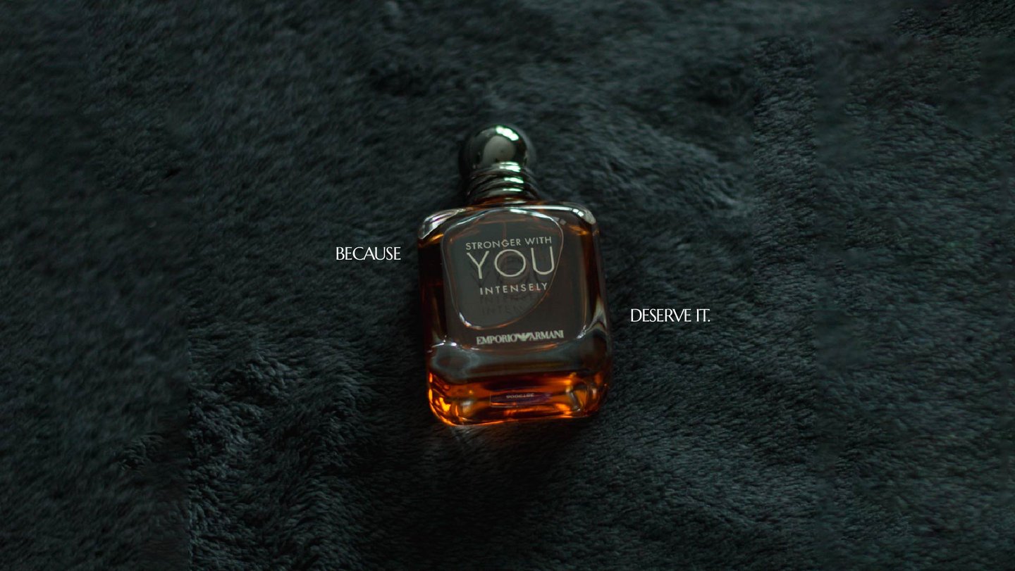
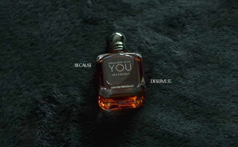
Refreshing the most known & loved Fragrance Reseller in Kosovo.
We were reached out by the team at Fragrance Obsession for a potential collaboration. At first they wanted to refresh the brand partially, after some discussing we agreed that the full brand will be reworked - from scratch.
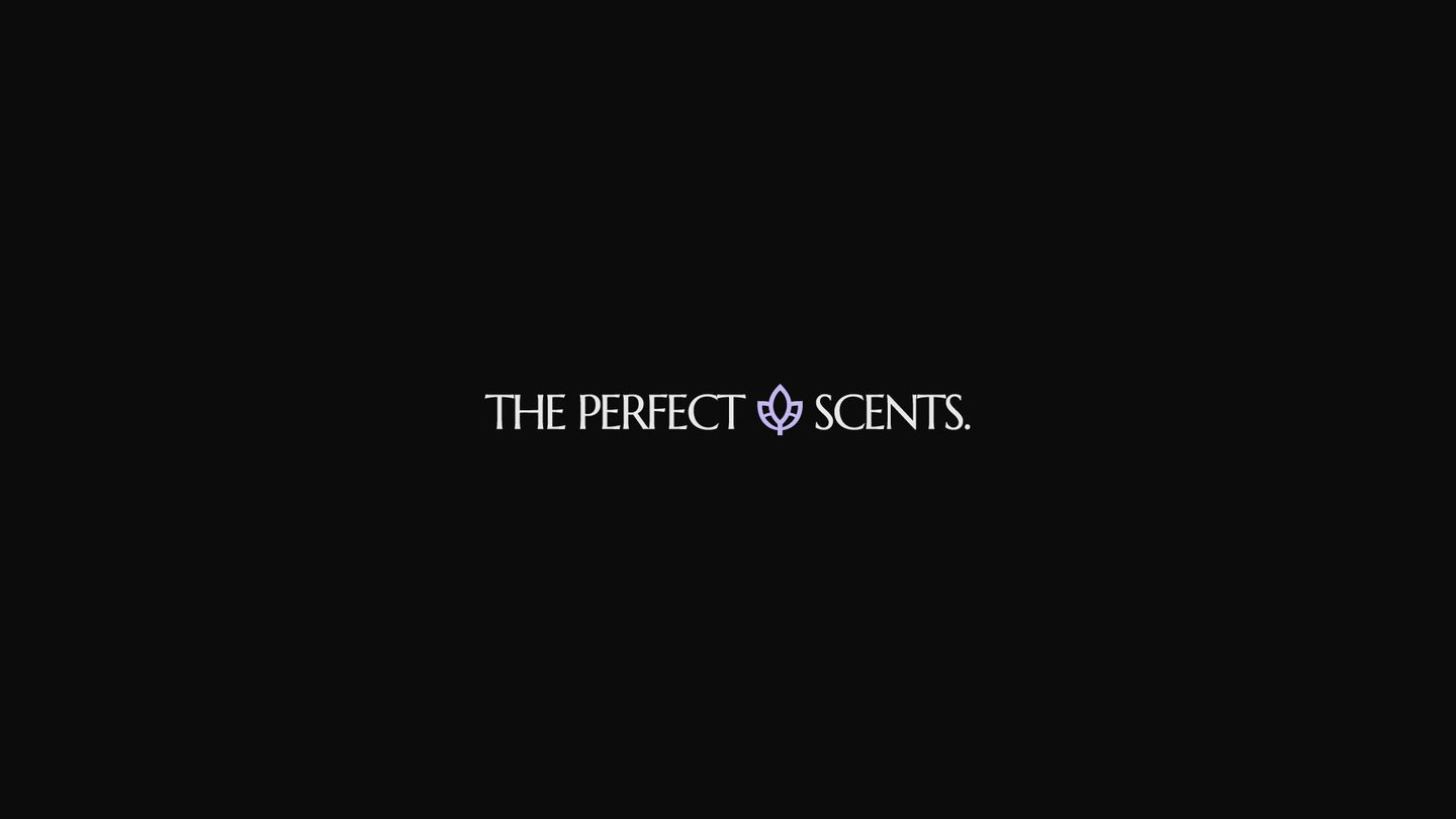
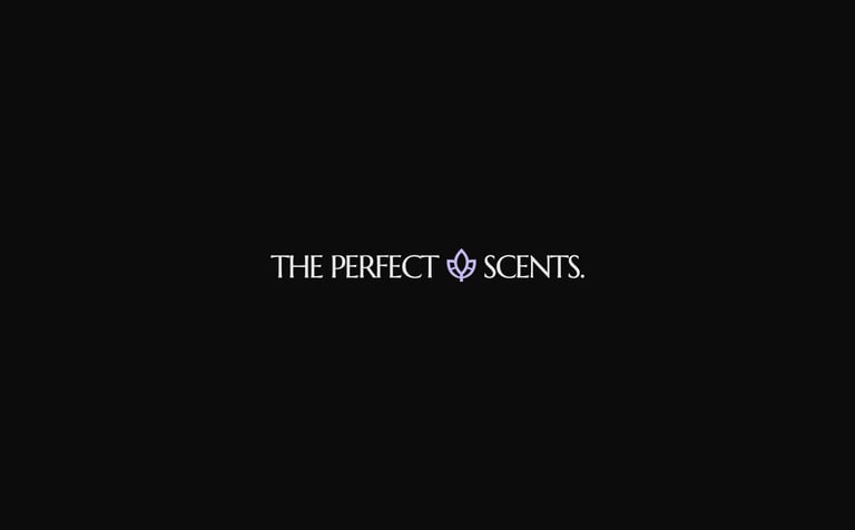
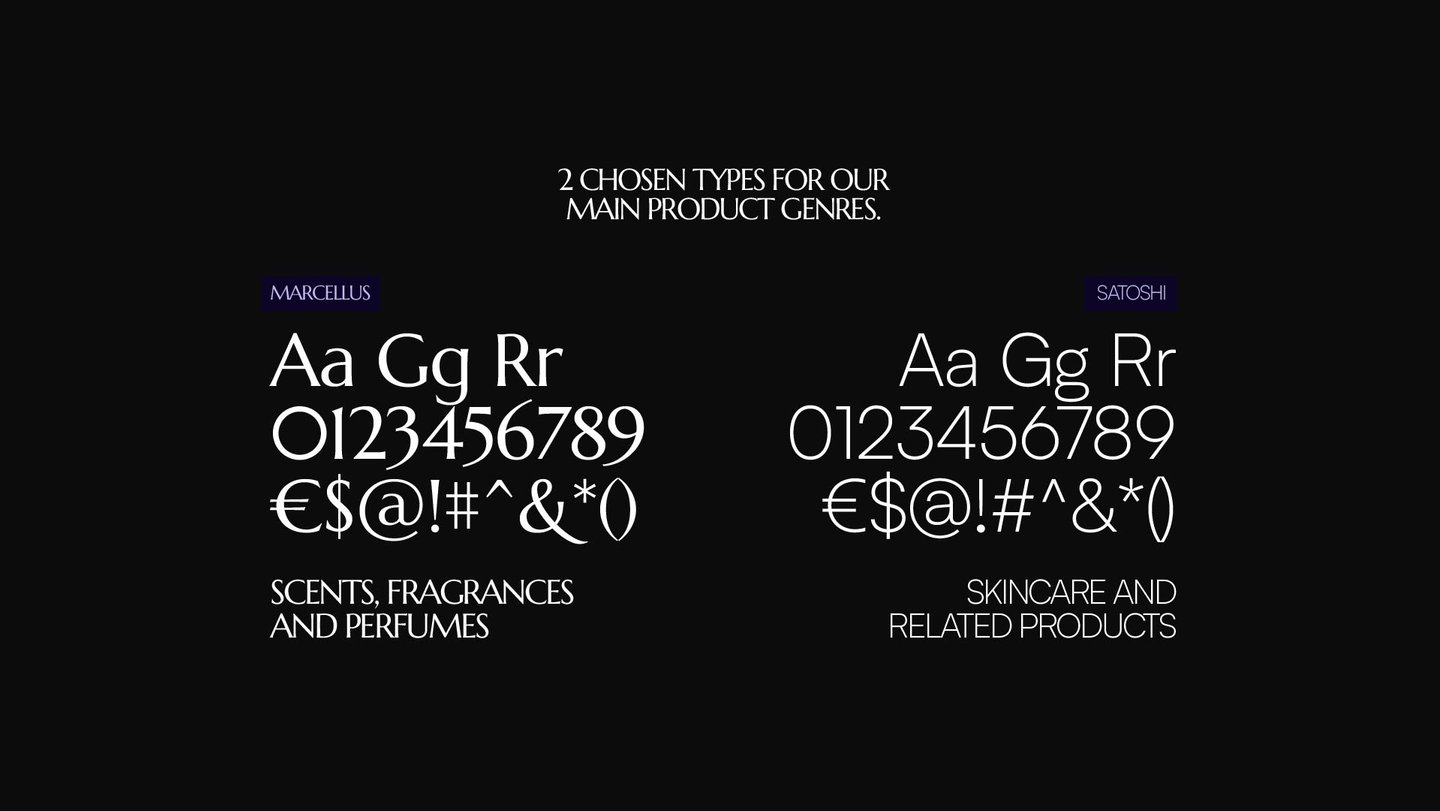
At first we started testing out possible types, we needed a type that clicks, that we love and that the fanbase will love. Something unique, sharp and mysterious.
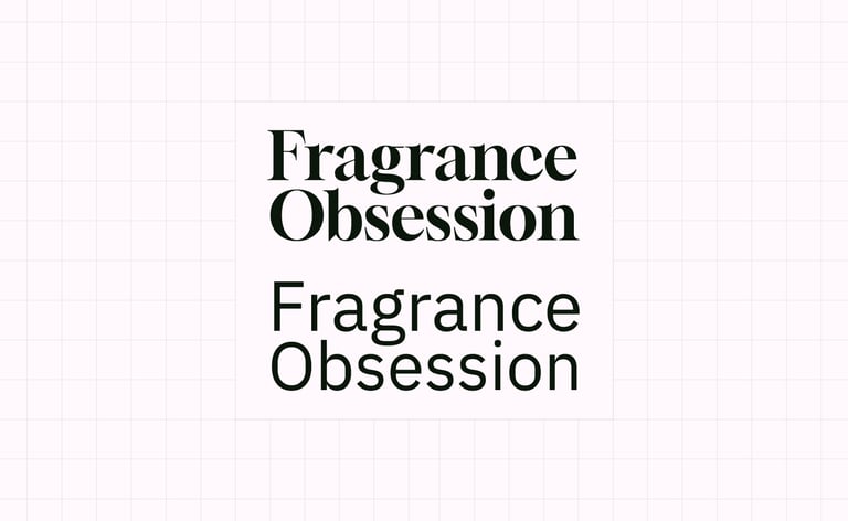
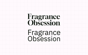
Although a lot of different variants were tested, a typical Serif or Sans Serif was not cutting it. Even when modified we were not really feeling it, it needed something more, something spicier if we could say. After many many tests we finally found the type! Behold, Marcellus from Google Fonts is here.


Your daily lifestyle simplified! More from them here.
Now this was more like it! A type that is a mixture between an old Serif and a New Era Sans Serif, nice sharp curvature which when modified slightly give it that lovely feel. We now were sold on the type. Only some small tweaks we're needed to it. Kerning was retouched a bit along with some glyphs.
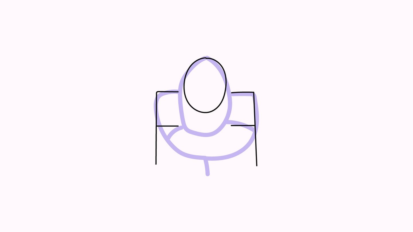

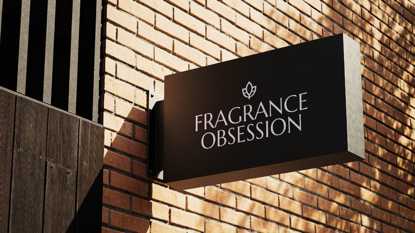
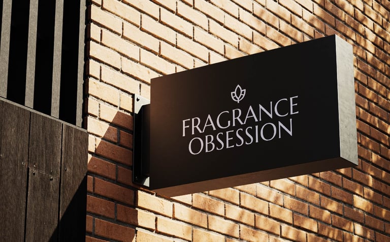
As funny as it may look, this was the first digital wireframe for the symbol. Basically this is where the idea first started, we wanted to integrate the lotus in the symbol as it has a huge role in the Fragrance world.
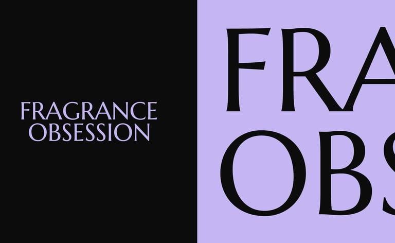
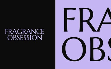
With the name itself being "Fragrance Obsession" this was a perfect fit. In the symbol we've taken inspiration from the previous symbol that they've had, where "F" and "O" are hidden inside the symbol itself.
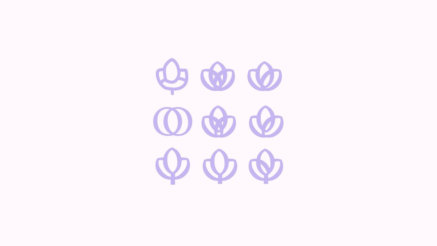
The real fun began when we started developing the symbol. We have had a million different tests, working out which style will fit and which style will suit our wordmark.
We also had to rethink on how we want the connection between the letters to be made, should they have a space to divide them or should they be connected? Logo talk, yeah...
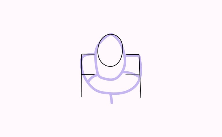
After the first tests, we were at a point where we liked the shape but the style definitely needed improvements.
To be more suitable with the wordmark, we needed sharp edges. Talking Gilette sharp here, or razor sharp. Hehe
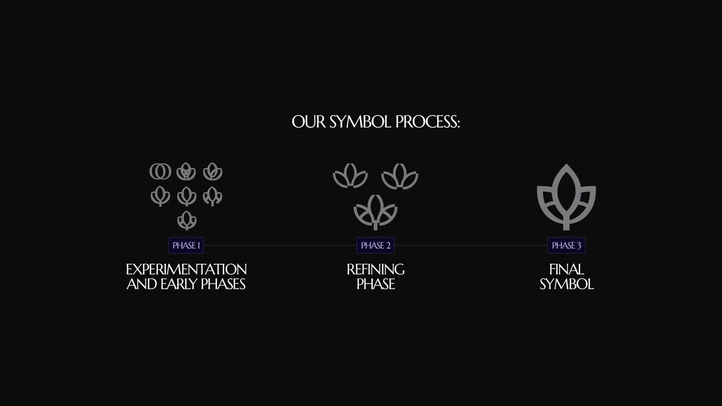
Voila! The Fragrance Obsession symbol was born. Sharp edges, lovely curvature and a perfect symmetry. It was ready to go along with the whole brand.